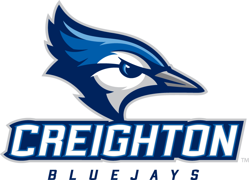
A different team from a different sport in a different country with a different spelling of its nickname is trying to get the Creighton Bluejays to change their logo."All goods and services in the class are opposed, namely: Athletic apparel, namely, shirts, pants, jackets, footwear, hats and caps, athletic uniforms," the opposition filing says.It's been more than 10 months since Creighton unveiled its new look for its new league.  By moving from the Missouri Valley to the Big East, the school had a rebranding overhaul take place last fall. But the Toronto Blue Jays have decided this new-look logo cannot be. The Blue Jays are fighting the existence of this Creighton logo on the grounds that it's too similar to their own, which has been part of Toronto's baseball appeal for decades.
 The differences: The birds are facing different directions; Creighton's logo has no red nor any sign the azure chickie is from north of the American border; there is no baseball in Creighton's emblem; Creighton's has a gray beak and much more dark blue; also, it's says "CREIGHTON BLUEJAYS."Even the spellings are different, Creighton going with the as-one-word "Bluejay."Nevertheless, Toronto filed papers on Aug. 11 with the U.S. Patent and Trademark Office. Read the contention here, which runs down a list of reasons why Toronto believes this blurs their brand too much.Matt Norlander/CBS Sports
Images via Creighton Athletics and Major League Baseball
 By moving from the Missouri Valley to the Big East, the school had a rebranding overhaul take place last fall. But the Toronto Blue Jays have decided this new-look logo cannot be. The Blue Jays are fighting the existence of this Creighton logo on the grounds that it's too similar to their own, which has been part of Toronto's baseball appeal for decades.
 The differences: The birds are facing different directions; Creighton's logo has no red nor any sign the azure chickie is from north of the American border; there is no baseball in Creighton's emblem; Creighton's has a gray beak and much more dark blue; also, it's says "CREIGHTON BLUEJAYS."Even the spellings are different, Creighton going with the as-one-word "Bluejay."Nevertheless, Toronto filed papers on Aug. 11 with the U.S. Patent and Trademark Office. Read the contention here, which runs down a list of reasons why Toronto believes this blurs their brand too much.Matt Norlander/CBS Sports
Images via Creighton Athletics and Major League Baseball


